




Native TextField, DatePicker, ContextMenu, ActionSheet, SelectionMenu, SegmentedControl, TabBar, NavigationRail, Button, ButtonGroup, FloatingActionButton, FloatingToolbar and LiquidGlass for React Native. Every component is the real platform widget on both iOS and Android (UIKit on iOS, Material 3 Expressive on Android), behind one typed, declarative API. No JavaScript re-implementations.

Every tile is the platform's own widget, captured from the example app. The docs site has full recordings of each component on both platforms; LiquidGlass is iOS 26 only.
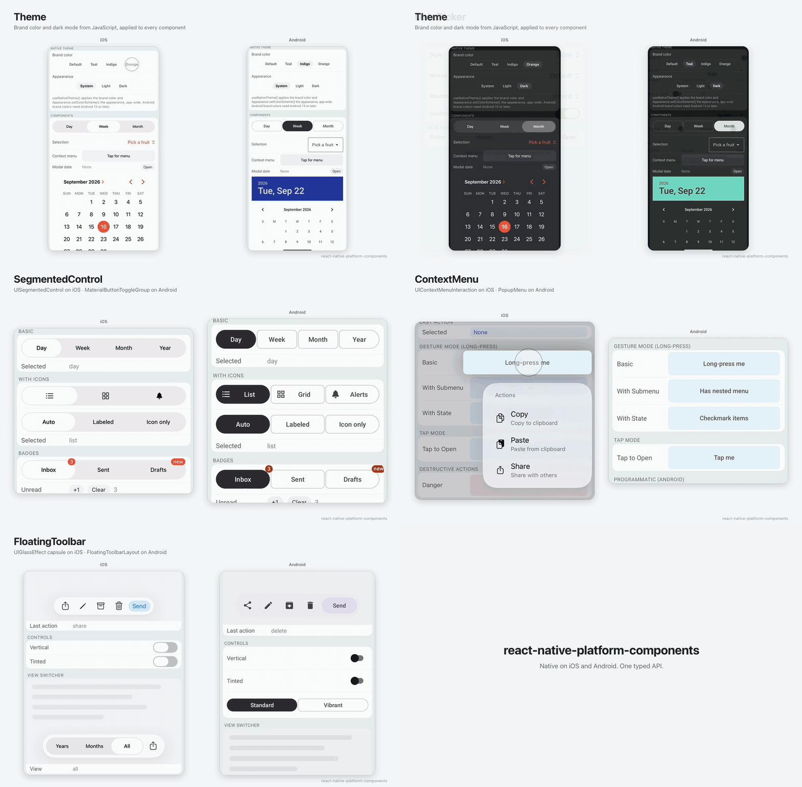
iOS on the left, Android on the right. Recorded by the Detox suite in example/.
npm install react-native-platform-componentsimport { SegmentedControl } from 'react-native-platform-components';
<SegmentedControl
segments={[
{ label: 'Day', value: 'day' },
{ label: 'Week', value: 'week' },
]}
selectedValue={range}
onSelect={setRange}
/>;That renders UISegmentedControl on iOS and Material 3 segmented buttons (MaterialButtonToggleGroup) on Android. The library needs the New Architecture: React Native 0.81+, or Expo SDK 54+ with a dev client (not Expo Go). See Installation and the documentation site.
| Component | iOS | Android | Instead of |
|---|---|---|---|
| TextField | UITextField / UITextView, with Writing Tools and the iOS 17–18 text traits |
Material 3 TextInputLayout: outlined or filled, floating label, supporting text, counter |
TextInput (a bare EditText on Android); react-native-paper (drawn in JavaScript) |
| DatePicker | UIDatePicker, modal or embedded |
MaterialDatePicker / MaterialTimePicker, or the AppCompat dialogs |
@react-native-community/datetimepicker (no Material 3 pickers) |
| SelectionMenu | System menus | Material exposed dropdown or Spinner |
@react-native-picker/picker (wheel or dialog, no menu) |
| ContextMenu | UIContextMenuInteraction |
PopupMenu |
zeego (through two more native packages) |
| ActionSheet | UIAlertController (.actionSheet), a popover pointing at its trigger on iPad and iOS 26 |
Material 3 modal bottom sheet (BottomSheetDialog) with icons |
react-native-actions-sheet (drawn in JavaScript); ActionSheetIOS (iOS only, no testIDs or anchor) |
| SegmentedControl | UISegmentedControl |
Material 3 Expressive connected buttons, or classic segmented buttons | @react-native-segmented-control/segmented-control (JavaScript on Android) |
| TabBar | UITabBar, the floating Liquid Glass bar on iOS 26 |
Material 3 navigation bar | React Navigation's bottom tabs (JavaScript); react-native-bottom-tabs (tied to its navigator) |
| NavigationRail | A column of tab-style UIButtons (iOS has no rail; use TabBar on iPhone) |
Material 3 Expressive NavigationRailView: header, badges, menu gravity, expanded rail |
React Navigation's drawer or a custom view (JavaScript) |
| Button | UIButton configurations, Liquid Glass variants on iOS 26 |
Material 3 Expressive MaterialButton: five sizes, shape morph |
react-native-paper (Material 3, not Expressive, in JavaScript) |
| ButtonGroup | A row of UIButtons with a "…" overflow menu; SplitButton: a button and a chevron UIMenu button |
Material 3 Expressive button groups, single or multiple selection, overflow menu; MaterialSplitButton |
react-native-paper segmented buttons (JavaScript) |
| FloatingActionButton | A round prominent UIButton, Liquid Glass on iOS 26 (iOS has no FAB) |
Material FloatingActionButton / ExtendedFloatingActionButton: four sizes, shrink on scroll |
react-native-paper FAB (drawn in JavaScript) |
| FloatingToolbar | Liquid Glass capsule on iOS 26, blur before | Material 3 Expressive FloatingToolbarLayout |
A custom view |
| LiquidGlass | UIGlassEffect on iOS 26+; LiquidGlassContainer merges and morphs it (UIGlassContainerEffect) |
A fallback View |
@callstack/liquid-glass, expo-glass-effect |
One package and one API shape: platform-only props go under ios={{ }} and android={{ }}, with Fabric + Codegen typed bindings, an Expo config plugin and TypeScript, instead of four or five packages with their own conventions, install steps and upgrade cadences.
Have a component request? If there's a native UI component you'd like to see added, open an issue describing the component and its native APIs on iOS and Android.
Using it in a shipped app? Open a PR to list it here.
Connect your existing web UI through PlatformComponentsProvider: register typed
web adapters once, then keep the same component imports, props and callbacks in
shared screens. Override only the controls you need; the others keep the existing
web fallbacks. iOS and Android continue using their native widgets.
See the web integration guide for setup, adapter examples, field refs and current fallback limitations.
npm install react-native-platform-components
# or
yarn add react-native-platform-components
iOS: cd ios && pod install. Nothing else to configure.
Android: nothing to configure. The components work with the default AppCompat app theme; give the app a Material 3 theme to have SegmentedControl and the Material pickers use your colors. See Android Theme Configuration.
Expo: needs a dev client or EAS Build (native code, so not Expo Go). The config plugin sets up the Material 3 theme for you:
{
  "expo": {
    "plugins": [
      [
        "react-native-platform-components/app.plugin",
        { "android": { "theme": "material3" } }
      ]
    ]
  }
}
Either form of the reference works: react-native-platform-components/app.plugin
as above, or the bare package name.
npx expo install react-native-platform-components
npx expo prebuild
npx expo run:ios   # or run:android
The library is built for the New Architecture (Fabric + Codegen) and does not support the old architecture.
Compatibility:
| Platform | Minimum |
|---|---|
| React Native | 0.81 with the New Architecture enabled |
| Expo SDK | 54, with a dev client or EAS Build (not Expo Go) |
| React | 19 |
| iOS | 15.1 (LiquidGlass needs iOS 26) |
| Android | API 24 (Android 7.0); Material Components 1.14 is bundled |
React Native 0.81 / Expo SDK 54 is the supported minimum. CI builds that combination with both Xcode 26 and Xcode 16.4; Liquid Glass is compiled out when the iOS 26 SDK is unavailable. Android is also built against React Native 0.76 in CI to check native compatibility below the supported minimum.
Full details: Installation.
Everything else lives on the documentation site:
- Quick Start: copy-paste examples for every component
- DatePicker, ContextMenu, ActionSheet, SelectionMenu, SegmentedControl, Button, ButtonGroup, FloatingToolbar, LiquidGlass: props, platform options and behavior
- Android Theme Configuration: Material 3 setup and what happens without it
- Icons: SF Symbols, drawables and images
- Theming and Colors: light/dark mode and your brand color from JavaScript (
useNativeTheme), accepted color formats
See the contributing guide to learn how to contribute to the repository and the development workflow.
MIT
Andrew Tosh — Santa Barbara, California
Full-stack developer with deep experience across entertainment and defense industries, specializing in simulation, visualization, and cross-platform mobile development. Technical focus areas include React Native, Rust, C++, real-time 3D visualization, and game engine technologies.
Available for contract work — Always interested in connecting with new clients for mobile development, visualization systems, and related projects. Hit me up at andrew.tosh@jarxconcepts.com.